Whether you’re brand new to creating PowerPoint presentations or you’re a pro, you can improve further by incorporating new PowerPoint design ideas.
1. How to Lock an Image in PowerPoint
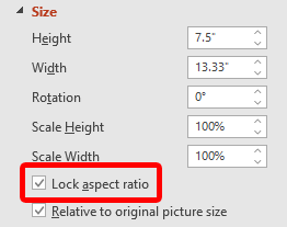
Locking an image in a PowerPoint presentation will prevent the image’s proportions or aspect ratio from getting distorted or out of scale. To lock an image in PowerPoint, follow the steps below: It’s also possible to lock an image or object so it cannot be resized or moved around the slide at all. This feature may be missing from most PowerPoint desktop versions. You might be able to right-click on an image, shape, or object and select Lock. If you don’t see that option, one workaround is to place objects into the master slide. To learn how, read how to edit master slides in PowerPoint.
2. Loop a Slideshow in PowerPoint
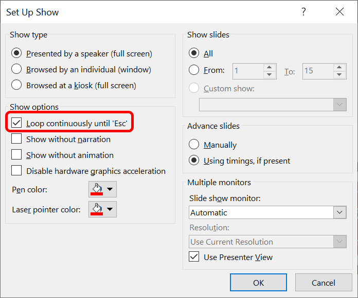
If you plan on continuously running a PowerPoint slide show, you can set the slideshow to loop instead of having to restart it manually. You’ll need to press the Esc key to end the looped PowerPoint presentation. Clicking on the final slide in your deck or pressing the right arrow key on your keyboard will cause the slideshow to restart.
3. How to Reduce the Size of a PowerPoint
PowerPoint files can become large if you’ve inserted high-resolution images or media files. We’ve got a few PowerPoint tips and tricks that can help reduce the size of your PowerPoint file.
Embed only the font characters used in your presentation by selecting File > Options > Save in the menu on the left.
If you’ve chosen to embed fonts in the file, select the Embed only the characters used in the presentation option.
Delete image editing data. When you edit an image in PowerPoint, it saves the original image and your edited version. To prevent this: Select File > Options > Advanced. Under Image Size and Quality, check the box labeled Discard editing data. To further reduce the size of your PowerPoint, uncheck the box labeled Do not compress images in file and opt for a lower default resolution for your images.
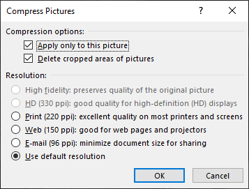
Compress images further by selecting an image in your slideshow. In the Picture Format tab, select the Compress Pictures button. You can choose whether to apply compression options to all images or only the picture you’ve chosen. Check the box labeled Delete cropped areas of pictures, and select Use default resolution. Press OK.
By reducing the size of your PowerPoint file, you’ll make the file easier to store and email.
4. How to Add and Print PowerPoint Notes
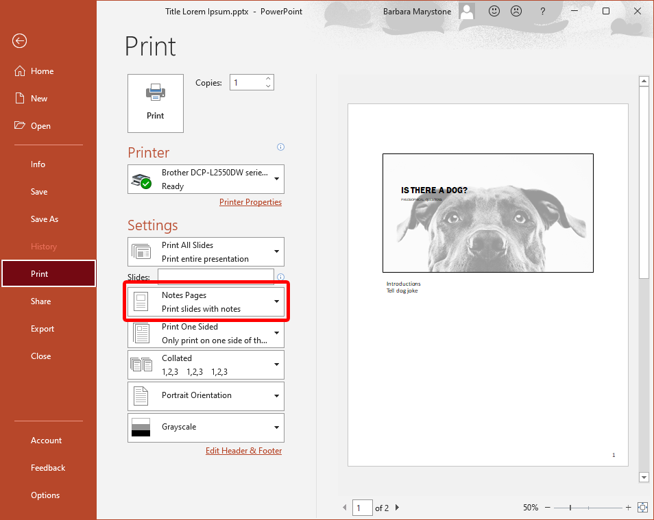
Add speaker notes to help the presenter remember what to say during the presentation by selecting the Notes button at the bottom of the PowerPoint. Type a script or just a few notes as reminders. To print the presentation with the notes, select Notes Pages in the Settings section of the Print dialog box.
5. How to Edit PowerPoint Backgrounds
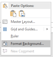
To add, remove, or edit a background graphic from your slides using the PowerPoint desktop app, you’ll need to select Slide Master from the View menu. Then, on the left, select the slide master or one of the layouts that appears below it: Right-click and select Format Background. Check a box labeled Hide background graphics. If you’re using PowerPoint in a browser, you might have noticed there is no slide master. When you use the online version, you can directly add, remove, or edit any graphics that appear on a slide.
6. How to Link to Another Slide in the Presentation
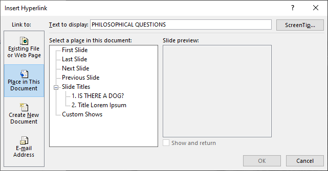
Linking to another slide in the same presentation can be helpful if you anticipate the need to skip part of your presentation due to time constraints or refer back to a previous slide. It is as simple as adding a hyperlink.
7. Stay Consistent by Using the Format Painter
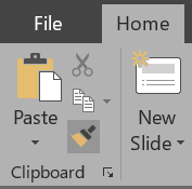
Consistency is a hallmark of a well-designed PowerPoint presentation. For example, slide headings should have the same color, font, and font size throughout the deck. Using the format painter makes standardizing all the headings and element labels in your presentation quick and easy. Simple. To apply formatting to multiple elements, double-click the Format Painter and repeat step #3 above until you’ve applied the formatting to all the elements you want. Press the Esc key to stop using the Format Painter.
8. Look Smart with SmartArt
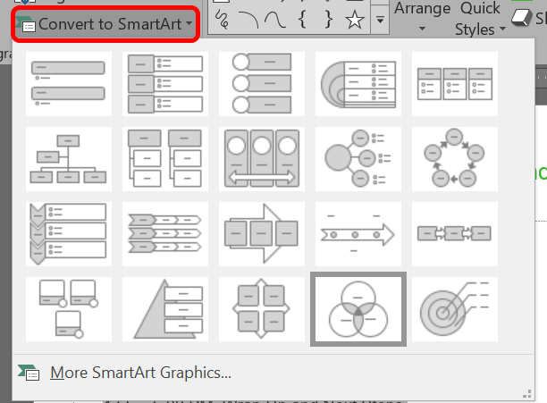
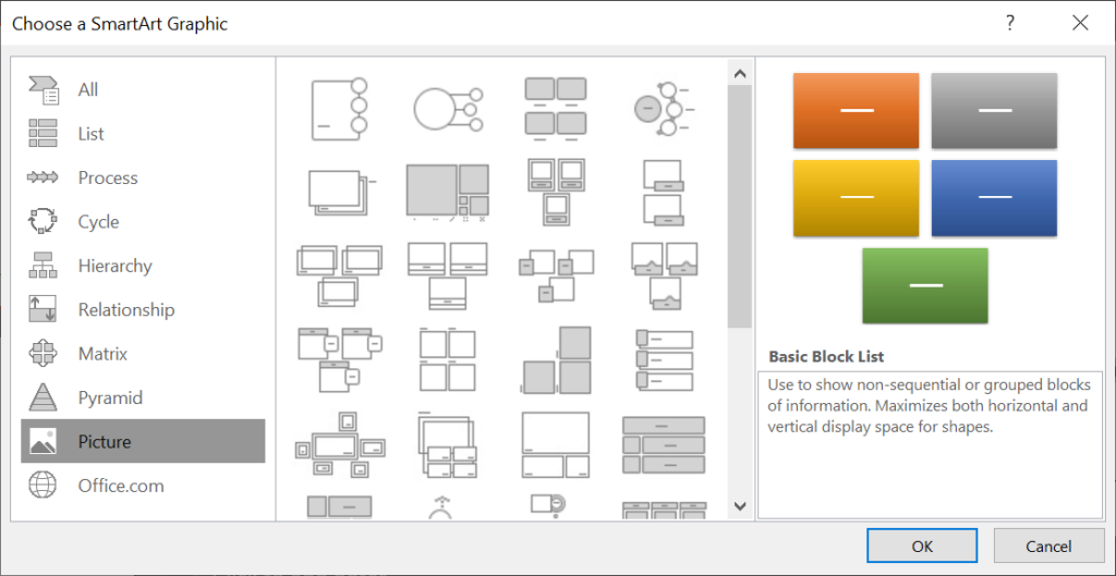
PowerPoint’s built-in SmartArt feature will help take your presentations to the next level. With SmartArt, you can convert plain, boring text to engaging graphics. The SmartArt gallery has dozens of options to choose from. One of them is bound to make your slide more engaging.
9. Align Your Objects
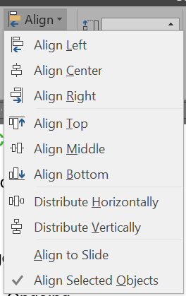
You’ve used the Format Painter to ensure your formatting is consistent throughout your presentation. While you’re at it, make sure all your objects are perfectly aligned using PowerPoint’s Align tool. Being intentional about how objects on your slides are aligned goes a long way to making a professional-looking presentation.
10. How to Use Picture Layout
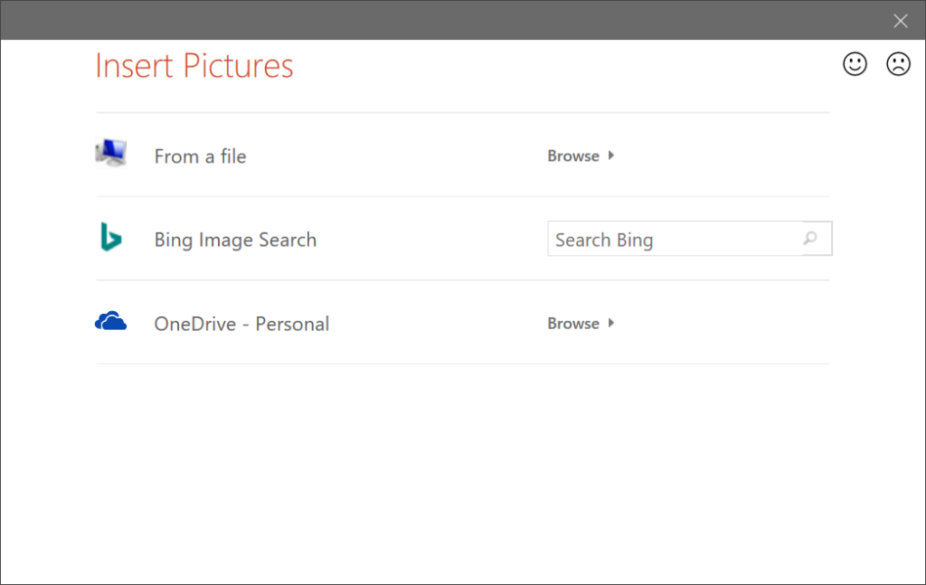
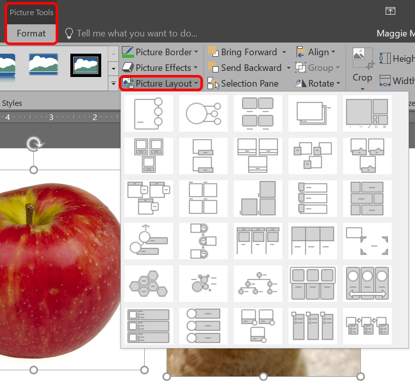
When you’re working with a slide with one or more images, try using PowerPoint’s built-in Picture Layout tool. It’s SmartArt for images. If you decide you don’t want to use a Picture Layout, you can convert your images back to Shapes by selecting Design > Convert > Convert to Shapes.
11. Be Sparing with the Slide Transitions
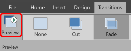
Once you discover that you can add animations between slides, you might be tempted to try them all. However, you should remember the cardinal rule of PowerPoint presentations: less is more. If you absolutely must use a transition, stick to the simple ones like Cut and Fade.
12. Use Animations Wisely
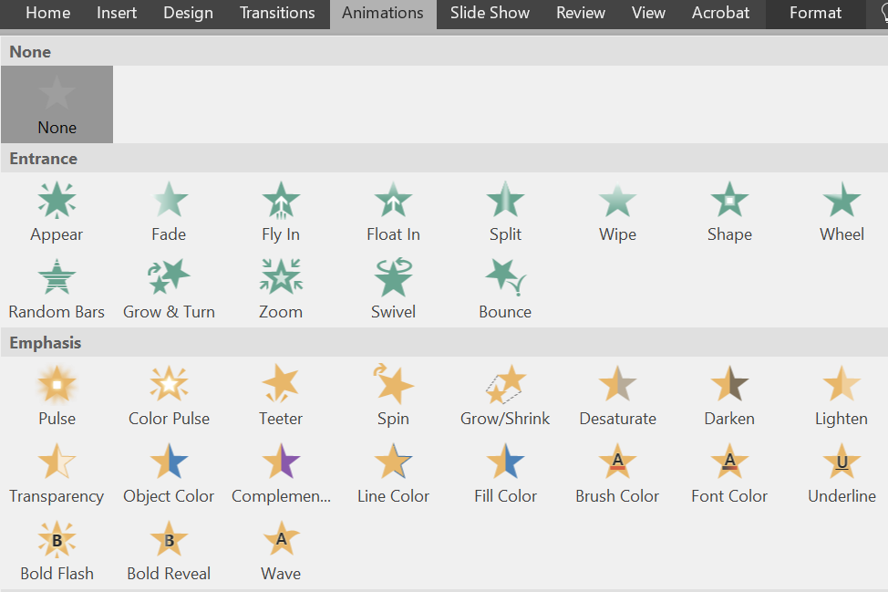
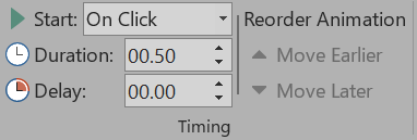
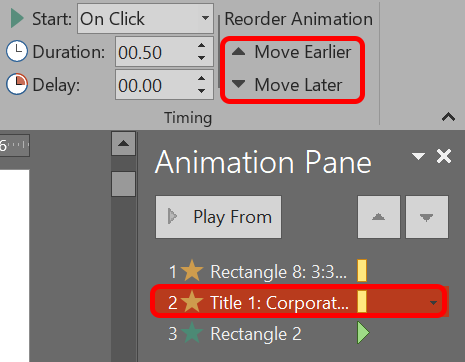
While you’re toning down your slide transitions, make sure you’re using animations judiciously, too. Animating text or objects on a slide can help the flow of your presentation, but too many animations can be distracting. Be discerning about when and where you use them. To add animations and effects: You can select different ways to start the animations. In the Timing section of the Animations tab, choose when to start the animation.
On click. This option will start the animation when you click the slide.With previous. Choose this option if you want the animation to play at the same time as the previous animation in the sequence.After previous. The animation will begin immediately after the prior one concludes.Duration. This option allows you to make an effect last longer or shorter.Delay. Add some time before an effect begins.
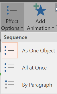
To change the order your animations play: To add an animation to a group of objects: If you use them the right way, animations can make your presentation clearer and easier for viewers to understand.
13. K.I.S.S.
PowerPoint slides are most effective when they’re simple. When you include only the most important information on your slides, you make it easier for people to digest and remember your message. You can always say more about the topic, but don’t pack the slide with more content than you need. After all, your audience should be listening more than reading.
14. Seek Out High Quality Templates, Images, and Graphics
When you keep it simple, that means using images and graphics that look good. We’ve rounded up some great stock photo sites and places to get beautiful PowerPoint templates.
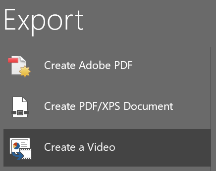
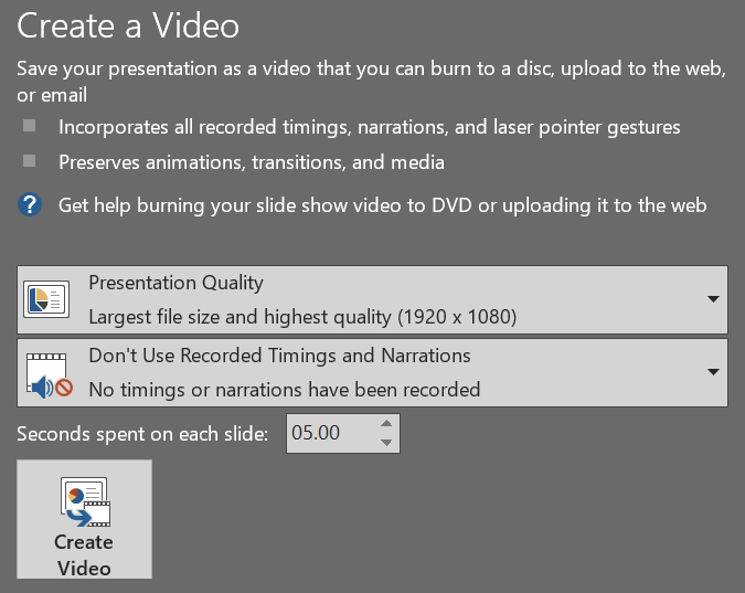
15. Export the Presentation as a Video
When you’re happy with your presentation, export it as a video: By implementing these tips and tricks, you’ll take your presentations to the next level! However, perhaps despite all the tips and tricks you’ve learned, you’ve decided to swear off the software entirely. So many PowerPoint presentations have put audience members to sleep that we now have a term for it: “death by PowerPoint.” In that case, say goodbye to Powerpoint, and check out these seven alternatives to PowerPoint that you can use online.


